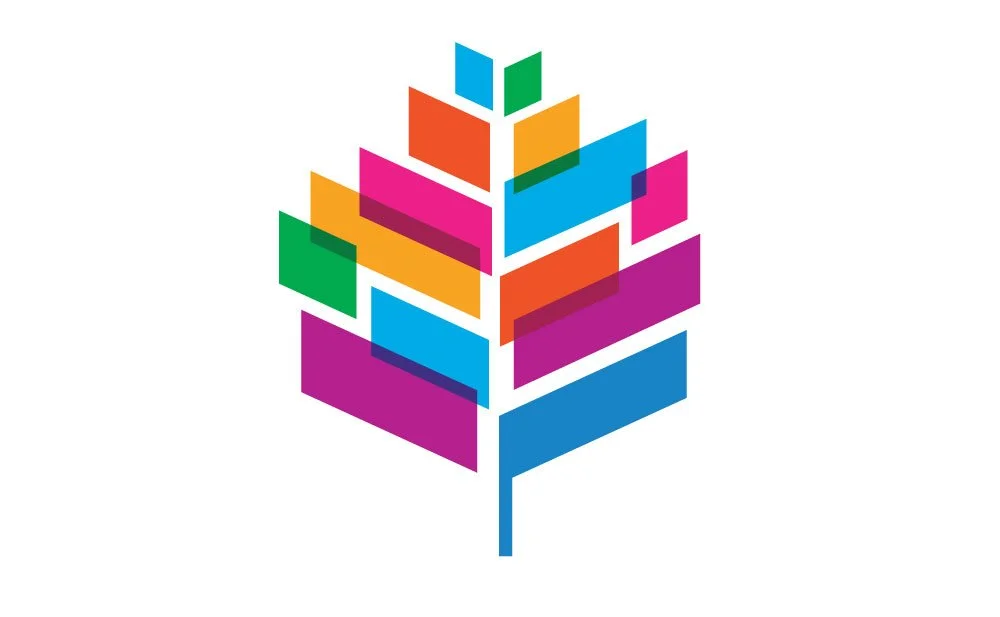
In 2024 KVD rebranded the Aspen Ideas Festival with the goal of creating a visual identity that reflects the power of dialogue and connection. The refreshed brand feels more fluid and transparent, capturing the spirit of openness that defines the festival. We wanted to celebrate the atmosphere where people from diverse backgrounds and beliefs come together to exchange perspectives. The new logo, while still echoing the previous design, introduces a more dynamic and layered approach—visually representing how ideas intersect, overlap, and spark new understanding. It tells a story of convergence, showing that even differing viewpoints can find common ground.
Our redesign centers around one key insight: Ideas don’t live in silos. At Aspen Ideas, innovation happens in the overlap—between disciplines, between people, between perspectives. To reflect this, we introduced a system of overlapping color fields that sit within the familiar leaf form.
Each translucent layer represents a stream of thought—a conversation, a discipline, a voice. Where they intersect, new colors emerge, symbolizing the generative power of cross-pollination. The result is both visually rich and conceptually resonant.
We extended the overlapping fields of the refreshed logo into a full visual system for the festival, using intersecting shapes, gradient transparencies, and color blends to evoke forward momentum and creative fusion. These elements appear throughout the festival’s event, digital and print communications, creating a cohesive and energetic identity that mirrors the theme’s spirit of exploration, anticipation, and boundary-pushing thought.


